¡Twitter analysis!
Basically the objective of this entry is to create an R code for the analysis of tweets that allows us to generate statistics on the interaction between an account and another, users, trends and some graphics that provide useful information for decision making. This code was presented in Colegio de ingenieros.
To do this we must follow the following steps: Create an app with Twitter , to do this we go to Twitter. Creating it is very simple, we just need a description and a name. The application will allow R to interact with Twitter by OAuth to perform this interaction between the application and our R session because you need the following:
- Consumer key
- Consumer secret
- Access Token
- Access Token secret
To obtain these four elements once created our application we press the Test OAuth button on the top right of the screen. And with these elements we begin to work in R through the package twitteR and some additional ones to be able to generate the final result.
Additionally you will need certain packages/bookshops/libraries which are:
- RJSONIO
- plyr
- bitops
- RCurl
- httr
- NLP
- tm
- RColorBrewer
- wordcloud
- XML
- dismo
- ggmap
- ggplot2
- leaflet
- classInt
- igraph
- dplyr
- purrr
- tidyr
- lubridate
- scales
- stringr
Note: The above mentioned will not be used in all cases, but it is recommended to download them for the next blog entries :).
Once the necessary packages are installed and loaded install.packages(“twitteR”) y library(twitteR) to load them. We also configure the necessary variables with the required values.
options(RCurlOptions = list(cainfo = system.file("CurlSSL", "cacert.pem", package = "RCurl")))
consumer_key <-  'XXXXXXXXXXXXXXXXXXXXXXXXXXXXXXXXXXXXXXXXX'
consumer_secret <- 'XXXXXXXXXXXXXXXXXXXXXXXXXXXXXXXXXXXXXXXXX'
access_token <- 'XXXXXXXXXXXXXXXXXXXXXXXXXXXXXXXXXXXXXXXXX'
access_token_secret <- 'XXXXXXXXXXXXXXXXXXXXXXXXXXXXXXXXXXXXXXXXX'
setup_twitter_oauth(consumer_key,consumer_secret,access_token,access_token_secret)
Remember that we must change the “X” for the values that we have obtained when we created our application in Twitter that will interact with R through OAuth and that’s why we use the setup_twitter_oauth so that TwitteR can get information from our application. We are already able to read Tweets and more!
First let’s do some simple searches with the following syntax:
searchTerm <- "@BlackHatEvents"
searchResults <- searchTwitter(searchTerm, n = 200, retryOnRateLimit = 100)
searchResults [1:10]
tweetFrame <- twListToDF(searchResults)
Ehe above code looks for everything related to @BlackHatEvents , specifically 200 tweets, shows the first 10 and converts it to a Data Frame
We then obtain information about the display name of each user, remove the NA and geolocate each one with:
userInfo <- lookupUsers(tweetFrame$screenName)
userFrame <- twListToDF(userInfo)
a<-userFrame[userFrame$location!="",c(7,12)]
y <- geocode(a$location)
b <- cbind(a,y)
final <- na.omit(b)
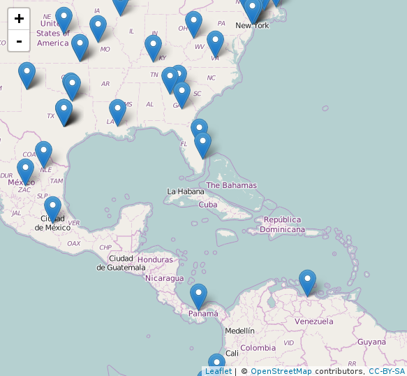
We create an interactive map and graph each user with their name.
Mapa <- leaflet()
Mapa <- setView(Mapa, lng =-66.690940, lat=10.00, zoom = 5)
Mapa <-leaflet(data = final ) %>% addTiles() %>% addMarkers(final$lon, final$lat, popup = ~as.character(final$name))
Mapa
We should see something more or less like this:
Customized searches by trend and date ranges
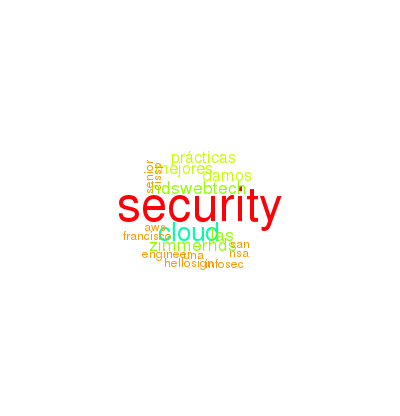
merida <- searchTwitter('#security', lang = "es", since = '2016-08-08', until = '2016-08-18',  retryOnRateLimit=100)
no_retweets <- strip_retweets(merida, strip_manual = TRUE, strip_mt = TRUE)
merida_texto <- sapply(merida, function(x) x$getText())
class(merida_texto)
str(merida_texto)

merida_corpus <- Corpus(VectorSource(merida_texto))
merida_corpus
inspect(merida_corpus[1])
We improve the text to create our first word clouds (We remove capital letters, accents and so on to improve visualization).
merida_clear <- tm_map(merida_corpus, removePunctuation)
merida_clear <- tm_map(merida_clear, content_transformer(tolower))
merida_clear <- tm_map(merida_clear, removeNumbers)
merida_clear <- tm_map(merida_clear, stripWhitespace)
inspect(merida_clear[1])
We can remove words we don’t want to see in the word cloud with:
merida_clear <- tm_map(merida_clear, removeWords, c("PALABRA ACA"))
merida_clear
We generate the word cloud with random colors / rainbow
wordcloud(merida_clear, random.order = F, scale = c(3, 0.5), colors = rainbow(200))
We check which words have a higher frequency and show the first 15 with the TermDocumentMatrix
dtm <- TermDocumentMatrix(merida_clear)
m <- as.matrix(dtm)
v <- sort(rowSums(m),decreasing=TRUE)
d <- data.frame(word = names(v),freq=v)
head(d, 15)
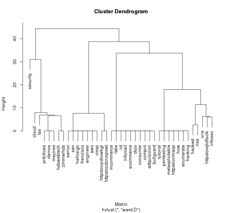
And we can make a Dendrogram
tdm <- removeSparseTerms(dtm, sparse = 0.95)
m <- as.matrix(tdm)
Matriz <- dist(scale(m))
cool <- hclust(Matriz, method = "ward")
plot(cool)
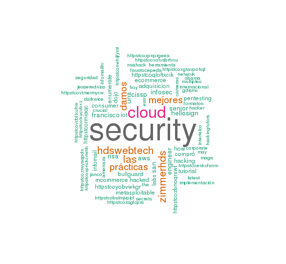
We generate another word cloud (prettier)
set.seed(1234)
wordcloud(words = d$word, freq = d$freq, min.freq = 100,
          max.words=80, random.order=FALSE, rot.per=0.35,
          colors=brewer.pal(8, "Dark2"))
We associate terms that are repeated at least 4 times
findFreqTerms(dtm, lowfreq = 4)
findAssocs(dtm, terms = "#security", corlimit = 0.3)
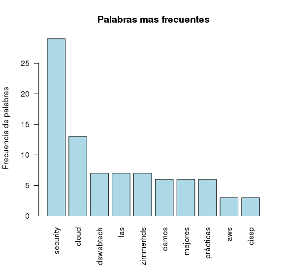
head(d, 10)
We represent them in a simple bar chart without many modifications.
barplot(d[1:10,]$freq, las = 2, names.arg = d[1:10,]$word,
        col ="lightblue", main ="Palabras mas frecuentes",
        ylab = "Frecuencia de palabras")
Additionally this information can be saved in a CSV
bc <- data.frame(text=unlist(sapply(merida_clear, '[', "content")), stringsAsFactors = F)
write.csv(bc, file = "tweets.csv")
##Now let’s go to an interesting part (Analyzing a user exhaustively)
usuario <-getUser("@jtmaderos")
friends.object<-lookupUsers(usuario$getFriendIDs())
followers.object<-lookupUsers(usuario$getFollowerIDs())
friends <- sapply(friends.object[1:30],name)
followers <- sapply(followers.object[1:10],name)
x <- as.matrix(friends)
write.csv(x, file = "ID USERS.csv")
The above code obtains a specific user and extracts all the information regarding friends and followers and then saves it in a file.
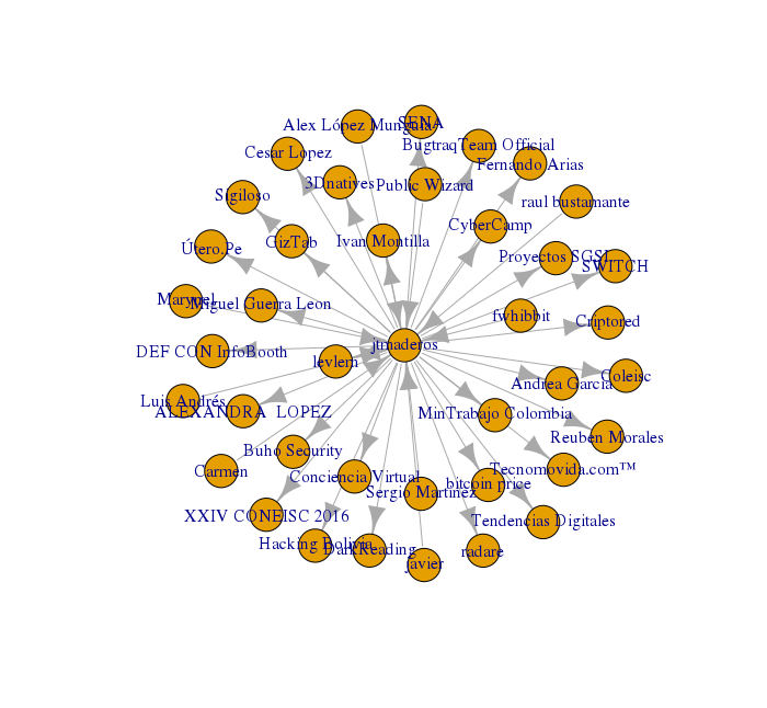
Then we generate a data frame called relations in which is the type of relationship that each user has with our “victim” @jtmaderos. (It’s simply the people who follow and those who follow him).
relations <- merge(data.frame(User='jtmaderos', Follower=friends),
                   data.frame(User=followers, Follower='jtmaderos'), all=T)
                   write.csv(relations, file = "relaciones.csv")
In addition, we generated some graphics to see it better.
g <- graph.data.frame(relations, directed = T)
V(g)$label <- V(g)$name
plot(g)
tkplot(g)
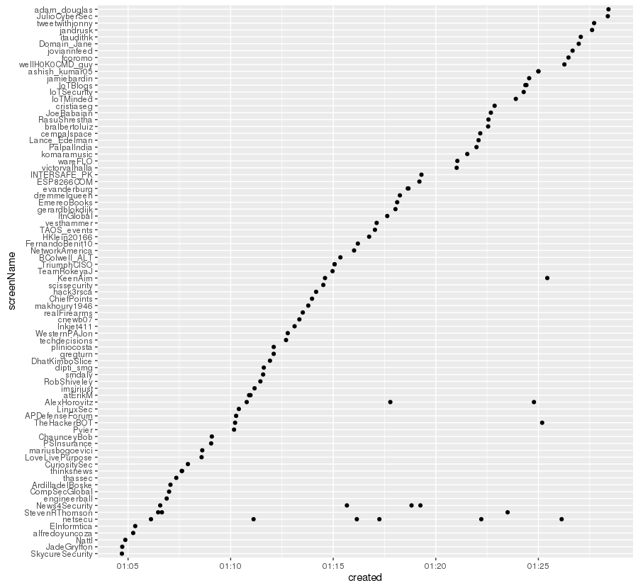
You can verify the time of creation of a Tweet by any user with:
searchTerm='#security'
rdmTweets <- searchTwitter(searchTerm, n=100)
tw.df=twListToDF(rdmTweets)
tw.dfx=ddply(tw.df, .var = "screenName", .fun = function(x) {return(subset(x, created %in% min(created),select=c(screenName,created)))})
tw.dfxa=arrange(tw.dfx,-desc(created))
tw.df$screenName=factor(tw.df$screenName, levels = tw.dfxa$screenName)
ggplot(tw.df)+geom_point(aes(x=created,y=screenName))
We plotted it again:
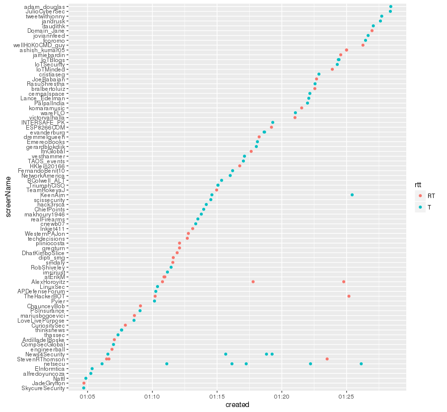
We improved the previous graph to obtain the Tweets and the rt differentiating them by color
trim <- function (x) sub('@','',x)
tw.df$rt=sapply(tw.df$text,function(tweet) trim(str_match(tweet,"^RT (@[[:alnum:]_]*)")[2]))
tw.df$rtt=sapply(tw.df$rt,function(rt) if (is.na(rt)) 'T' else 'RT')
ggplot(tw.df)+geom_point(aes(x=created,y=screenName,col=rtt))
The result!:
We can also know from what device and at what specific time he tweet. For this the code:
sujeto_tweets <- userTimeline("realDonaldTrump", n = 3200)
sujeto_tweets_df <- tbl_df(map_df(sujeto_tweets, as.data.frame))
tweets <- sujeto_tweets_df %>%
  select(id, statusSource, text, created) %>%
  extract(statusSource, "source", "Twitter for (.*?)<") %>%
  filter(source %in% c("iPhone", "Android"))
tweets %>%
  count(source, hour = hour(with_tz(created, "EST"))) %>%
  mutate(percent = n / sum(n)) %>%
  ggplot(aes(hour, percent, color = source)) +
  geom_line() +
  scale_y_continuous(labels = percent_format()) +
  labs(x = "Horas (EST)",
       y = "% de tweets",
       color = "")
Which generates:
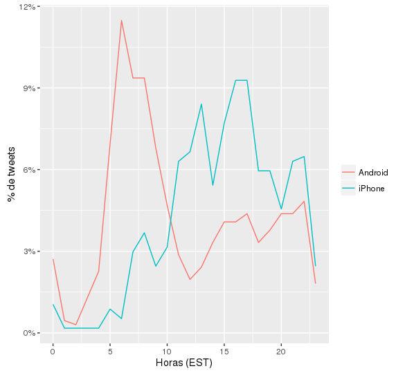
Note: Take into account that we use another user (To better see the distribution of devices used)
We are done ! Now we just need to use creativity a little more to create more interesting things, if you need to replicate this POC do not hesitate to contact me!
HACKED!