¡Earthquakes!
In this post we are going to make an analysis to a Seismic Swarm occurred in Venezuela specifically in the Andean region of that country (It should be noted that the data are provided by FUNVISIS and are not publicly accessible). I simply work with the data since I am currently working there as a seismogram analyst In principle the data is in a format that requires additional work to convert it into a kind of table and thus be able to handle them more comfortably for me, not addressed in this post what is Data Cleaning
The first thing is to start loading our libraries
library(rgl) library(scatterplot3d) library(RColorBrewer)
One of which is very important is rgl and you can test it with open3d() in “R”. After doing the necessary treatment to our data we proceed to generate our variables.
datos <- read.table("/RUTA ACA/sismos_vigia.txt", header = TRUE)
Visualizamos con head(datos):
  year month day hour minute second latitude longitude depth mag1 typ_mag1       date
1 2015    11   1    1     27   20.0    6.727   -72.992 168.6  2.8     WFUN 2015-11-01
2 2015    11   2   14     31   13.6    7.015   -73.223 186.1  3.4     WFUN 2015-11-02
3 2015    11   2   15     41   44.9    7.182   -73.395 140.1  3.0     WFUN 2015-11-02
4 2015    11   3   12      4   48.2    7.242   -73.259 158.4  3.0     WFUN 2015-11-03
5 2015    11   6    1     35   37.6    6.951   -73.265 171.7  3.2     WFUN 2015-11-06
6 2015    11   6    3     26   47.4    8.685   -70.752   5.0  2.3     WFUN 2015-11-06
Something important whenever we work with tables or almost any type of data frame or object is to know its characteristics properties among others, so what we will do is to know the name of the columns we have with:
colnames(datos)
[1] "year"      "month"     "day"       "hour"      "minute"    "second"    "latitude"  "longitude" "depth"     "mag1"
[11] "typ_mag1"  "date"
We see that they are the names of each column seen previously with head(data) , this is will allow us to decide that we want to graph in 3D. For our case they will be magnitude and depth, that is to say we want to visualize the seismic events according to the depth in a specific region to give us an idea of the spatial distribution of the same ones. Therefore we generate our variables and our 3D plot:
mag <- (datos$mag1)
prof <- (datos$depth)
plot3d(mag,prof)
Giving us a 3D interactive window that allows us to move and see the data that before was a table in something more useful and presentable.
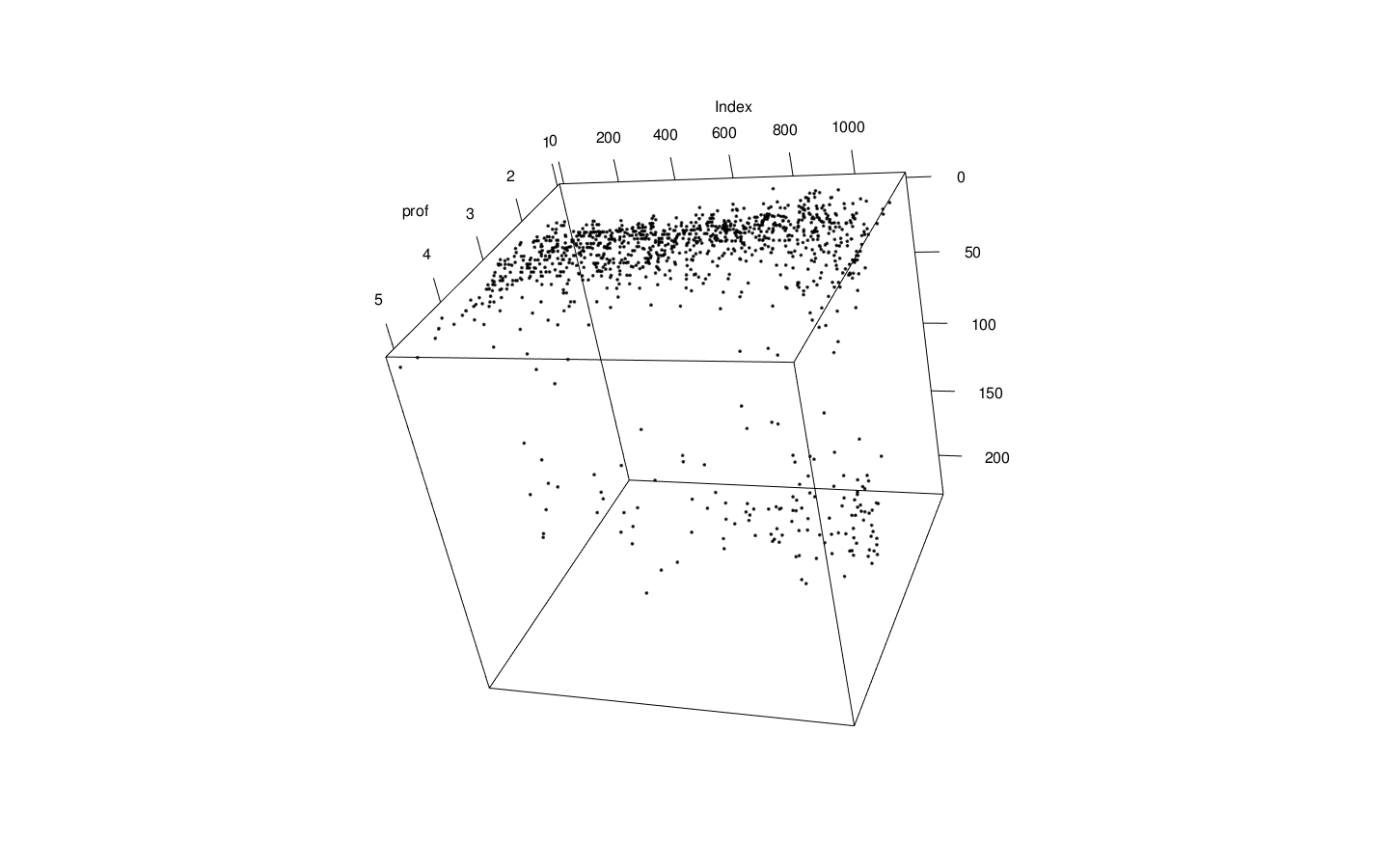
This 3D graphic is kind of crappy so let’s try to put some color on it and touch some of its options:
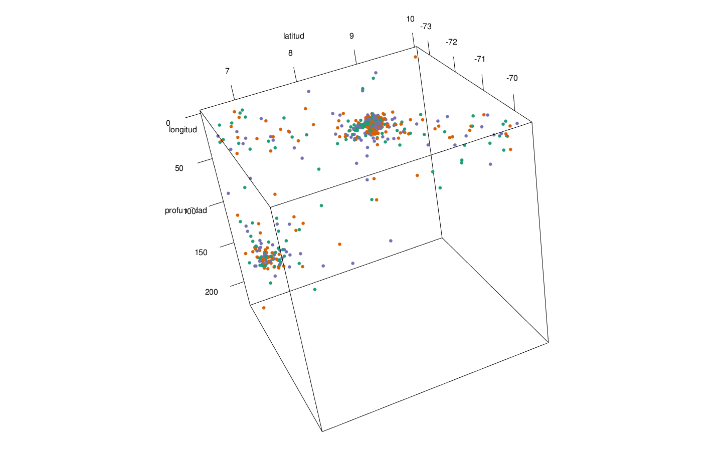
latitud<- (datos$latitude)
longitud<- (datos$longitude)
profundidad<- (datos$depth)
plot3d(latitud,longitud,profundidad, col=brewer.pal(3, "Dark2"), type = "p", size = 7)
Subtly improving :)
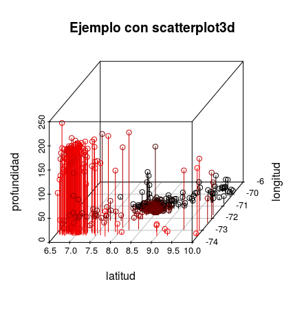
And as a final resource for this post we could generate a scatterplot3d (Only it came out upside down XD), which allows us something similar but in 2D and static.
jj <- scatterplot3d(latitud,longitud,profundidad, pch = 1, highlight.3d = TRUE, type = "h", main = "Ejemplo con scatterplot3d", angle = 45)
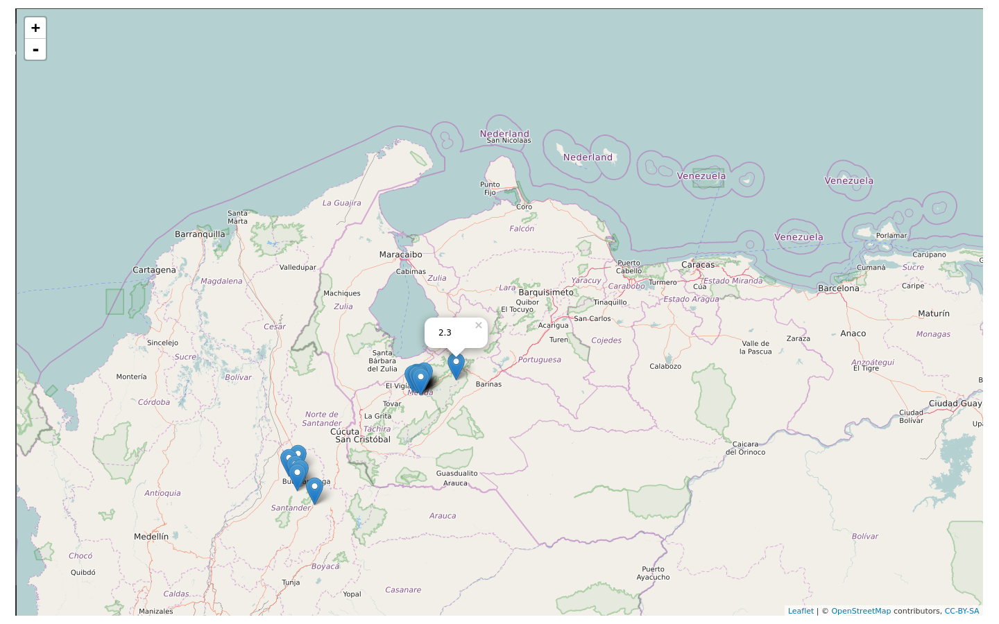
Of course we can also generate interactive maps as it has been done before, what we need to do is this:
Load the library:
library(leaflet)
We create a variable called Map and we configure the view in a specific point, in our case Venezuela
Mapa <- leaflet()
Mapa <- addTiles(Mapa)
Mapa <- setView(Mapa, lng =-66.690940, lat=10.00, zoom = 5)
We read the data that interest us:
data <- read.table("sismos_vigia.txt", header = TRUE)
Then we make the assignment of the information:
Mapa <-leaflet(data = data[1:20,]) %>% addTiles() %>%addMarkers(~longitude, ~latitude, popup = ~as.character(mag1))
HACKED!