Sharks
Graphic Representation of Shark Attacks in Latin America
The Florida Museum tries to inspire people to care about life on Earth in many ways and by exploring their website I was able to find some interesting facts about shark attacks around the planet, so I decided to play with the data a little bit. The first thing is to get the Data, the same ones can be obtained of several ways like for example: Web scraping, but in our case only we will copy and we will paste since they are few (remembering to save them as csv.)
We will start by configuring the environment.
rm(list = ls())
setwd("/home/gelvis/Desktop/")
library(dplyr)
library(ggmap)
library(ggplot2)
library(leaflet)
We load the data into a variable and proceed to make simple validations such as : View the data, summary and values.
ataques <- read.csv("ataques.csv", stringsAsFactors = FALSE)

> head(ataques)
                    países total
1                      USA  1407
2                Australia   621
3 Republic of South Africa   252
4                   Brazil   104
5              New Zealand    51
6         Papua New Guinea    48
> summary(ataques)
    países              total
 Length:90          Min.   :   1.00
 Class :character   1st Qu.:   2.00
 Mode  :character   Median :   4.00
                    Mean   :  33.68
                    3rd Qu.:  11.00
                    Max.   :1407.00
> lapply(ataques, class)
$países
[1] "character"

$total
[1] "integer"
Now with all the data and its characteristics we can make a first graphic representation.
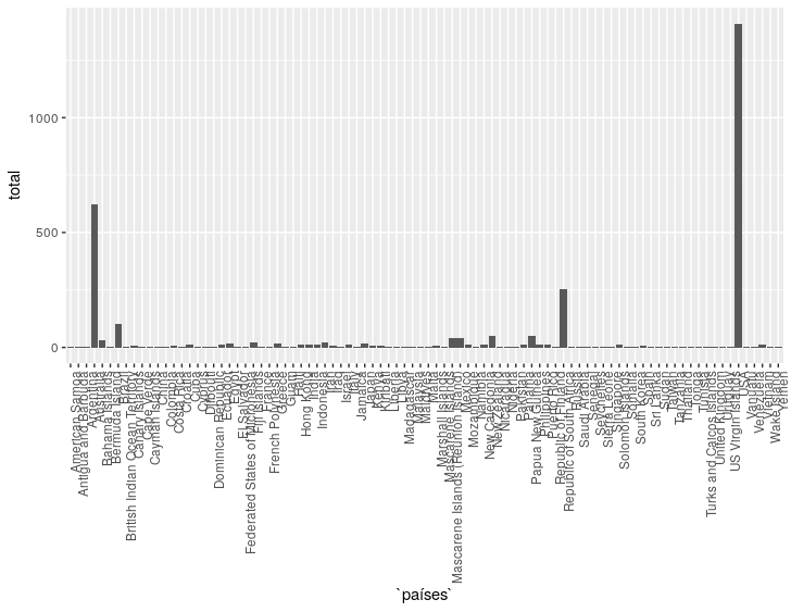
Obviously this is a graph that is not very well understood, since it is “a lot of data”, but we could only select the data from Latin America to better visualize the data.
We read our data.
la <- read.csv("latinoamerica.csv", stringsAsFactors = FALSE)
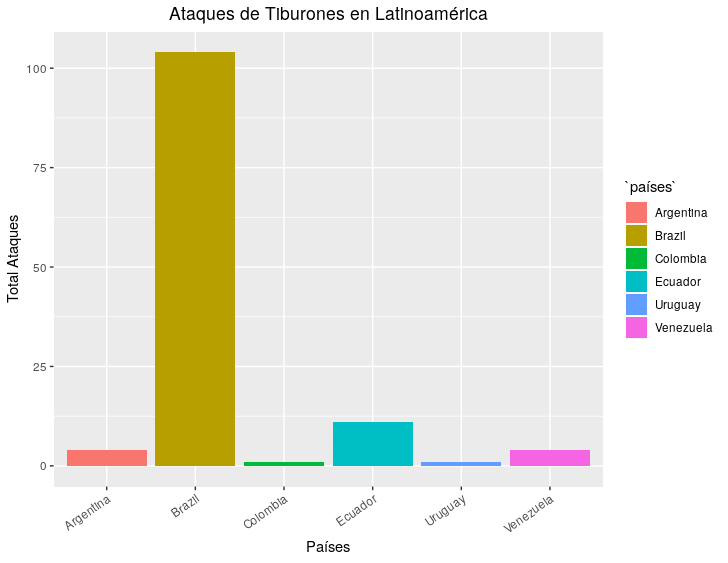
ggplot(la, aes(x = países, y = total, fill = países)) +
geom_bar(stat = "identity") +
xlab("Países") +
ylab("Total Ataques") +
ggtitle("Ataques de Tiburones en Latinoamérica") +
theme(axis.text.x = element_text(angle = 35, hjust = 1)) +
theme(plot.title = element_text(hjust = 0.5))
Once the data we need is loaded, we generate the following result.
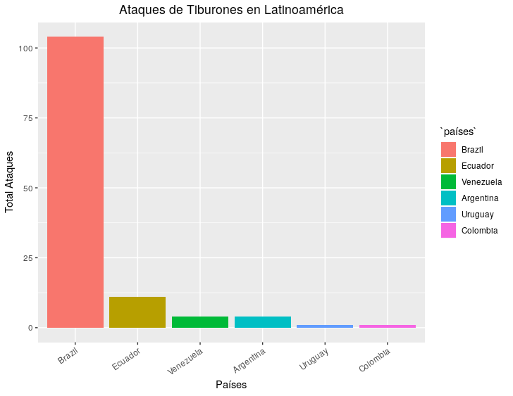
Finally we can order the graphic to look a little more orderly.
la$países <- factor(la$países, la$países)

ggplot(la, aes(x = países, y = total, fill = países)) +
  geom_bar(stat = "identity") +
  xlab("Países") +
  ylab("Total Ataques") +
  ggtitle("Ataques de Tiburones en Latinoamérica") +
  theme(axis.text.x = element_text(angle = 35, hjust = 1)) +
  theme(plot.title = element_text(hjust = 0.5))
The attacks could be located on a map if the necessary data (latitude and longitude) were declared in the data set, it will be for the next :).
Best Regards..